Building a solid brand strategy, a crafted identity and a seamless Webflow experience
In early 2024, we embarked on a close collaboration with Vision People to redefine and elevate their visual identity. As a leading provider of advanced business management solutions, it was essential to craft a design language that reflected their technical precision, innovation, and strategic vision.
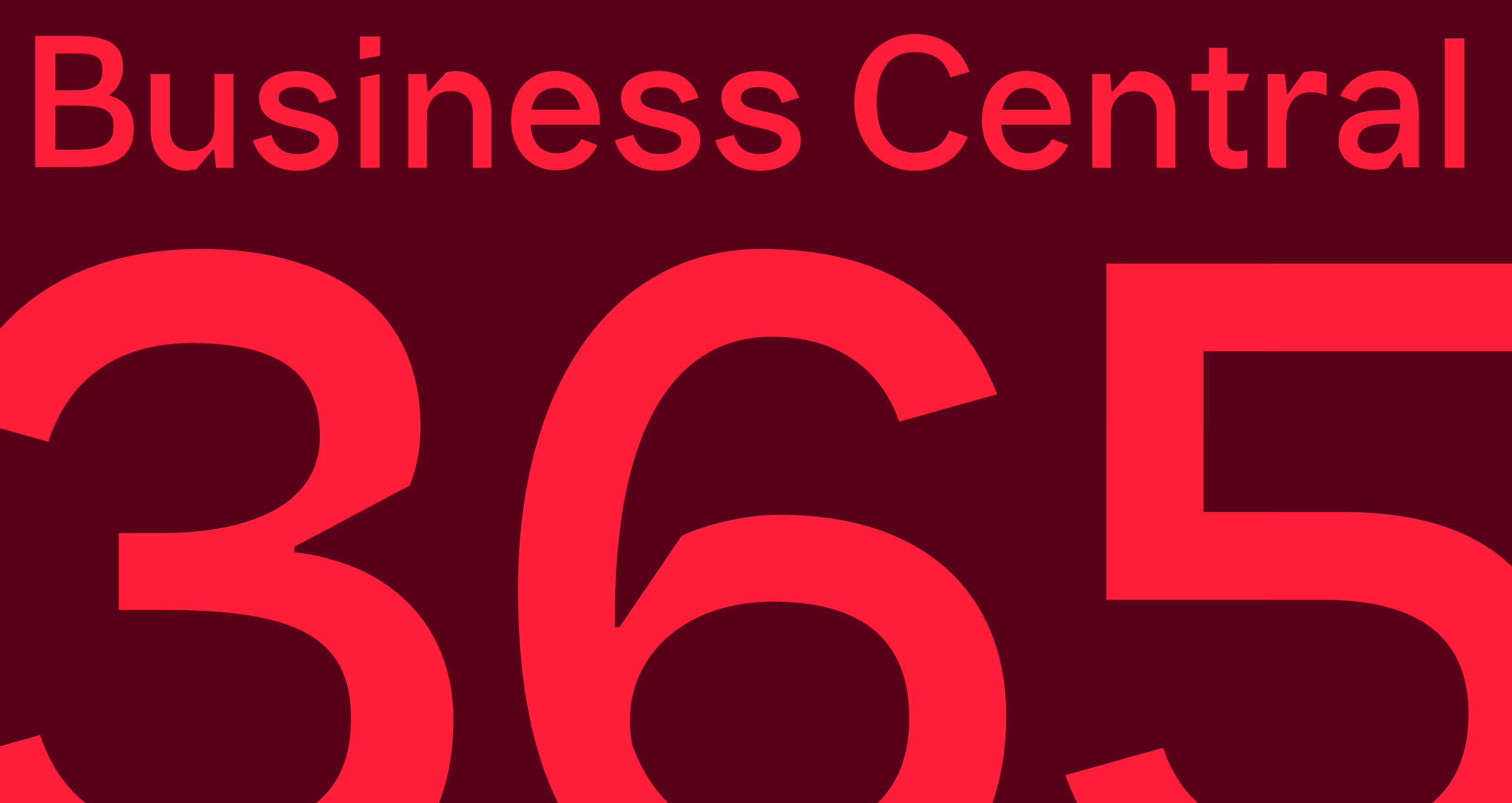
Vision People sought to distinguish themselves within a crowded IT landscape while preserving their signature red — a color deeply rooted in their heritage. Through a comprehensive brand audit and workshops with key stakeholders, we redefined their narrative and established a coherent tone of voice that unites every brand expression.
The main challenges:
- Preserve Vision People’s recognizable heritage while redefining their brand for a new digital era.
- Create a unified design language that bridges technology, communication and human insight.
- Develop a bespoke visual system — including custom typography and 3D design — that feels both modern and timeless.
Bringing the brand to life
To create a coherent expression across strategy, identity and digital experience, we developed a holistic solution built on five key pillars:
- Brand platform and tone of voice
We defined Vision People’s core messages, values and communication style — balancing technical precision with human warmth. The tone of voice reflects confidence, clarity and authenticity across all touchpoints. - Visual identity and design system
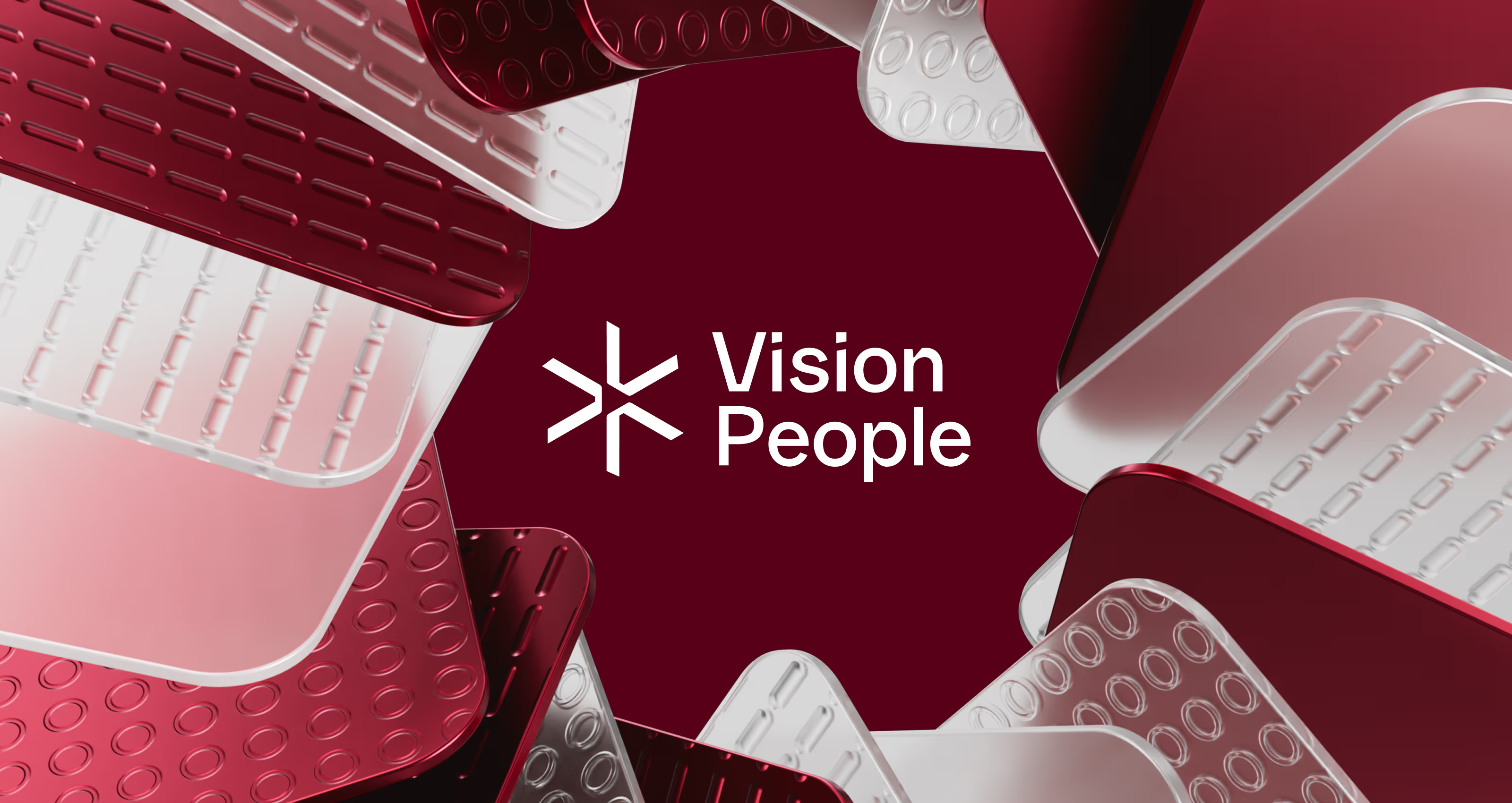
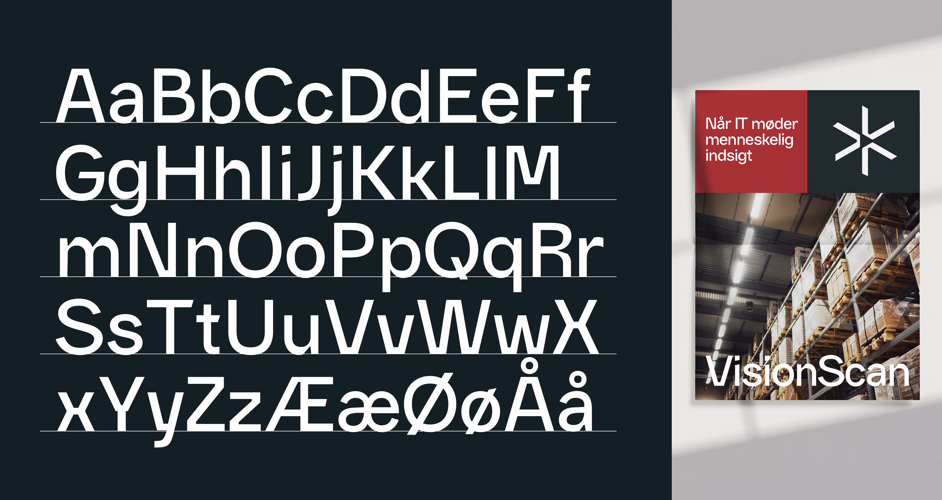
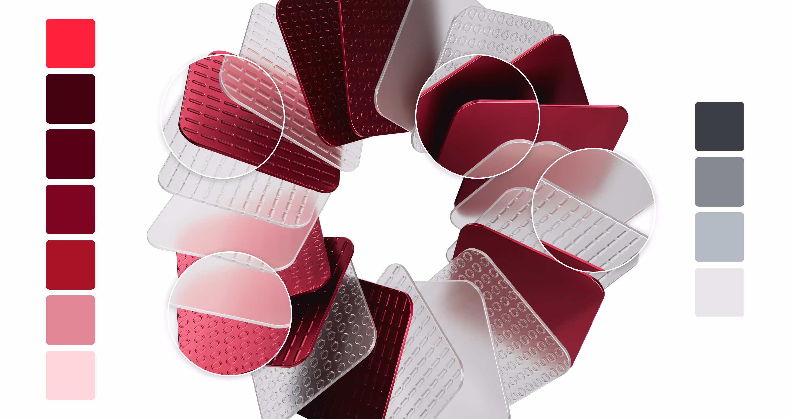
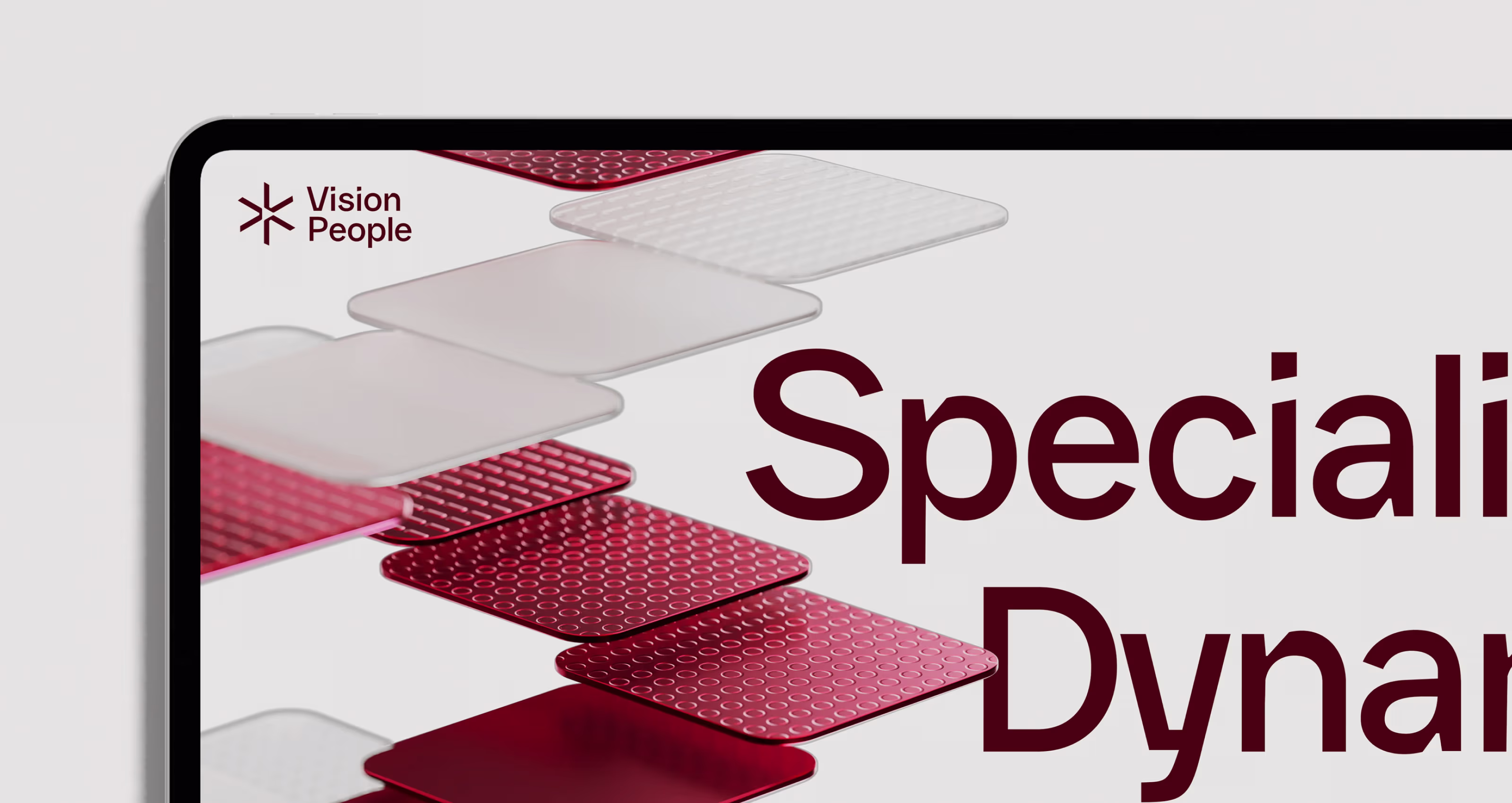
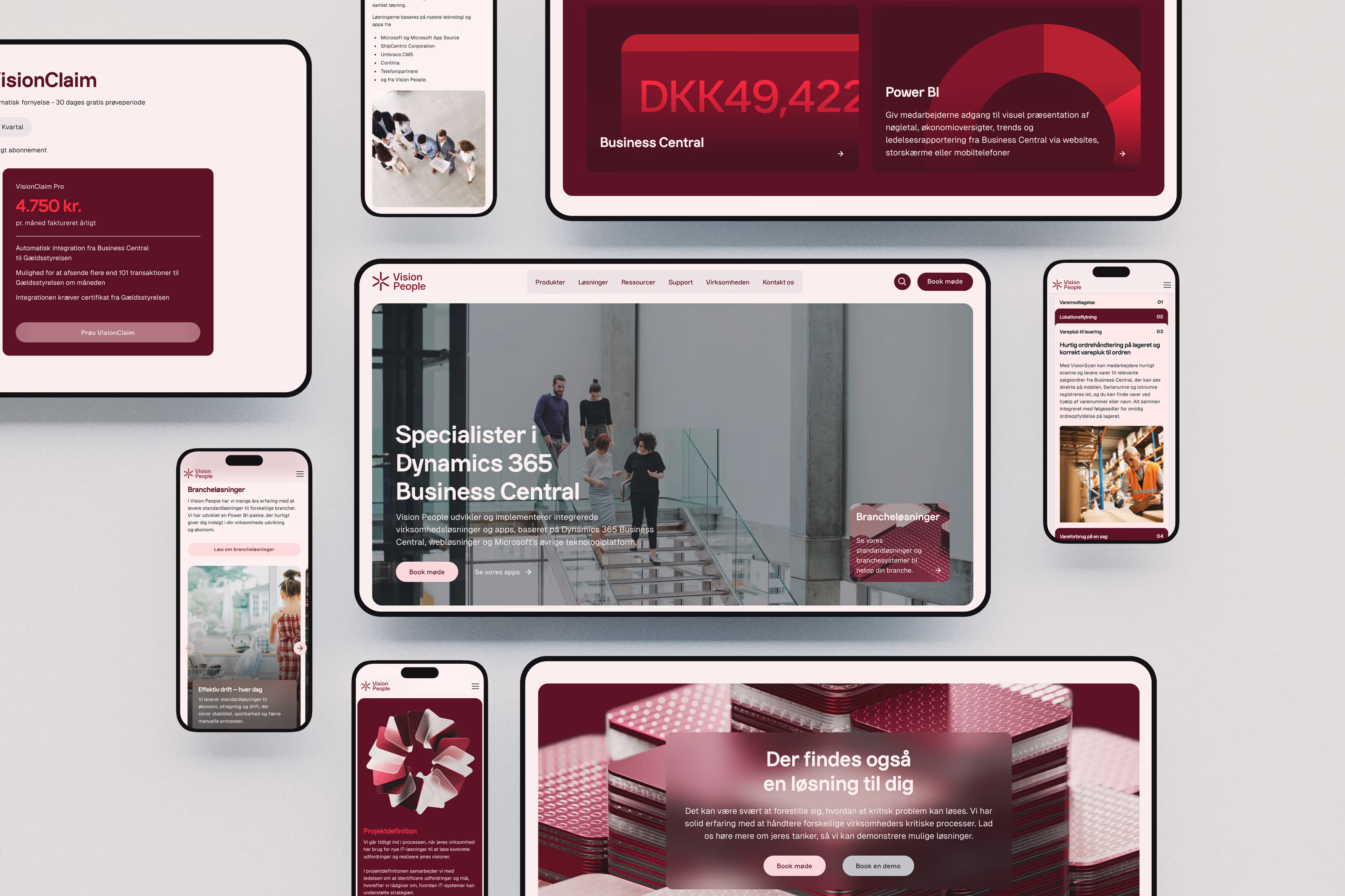
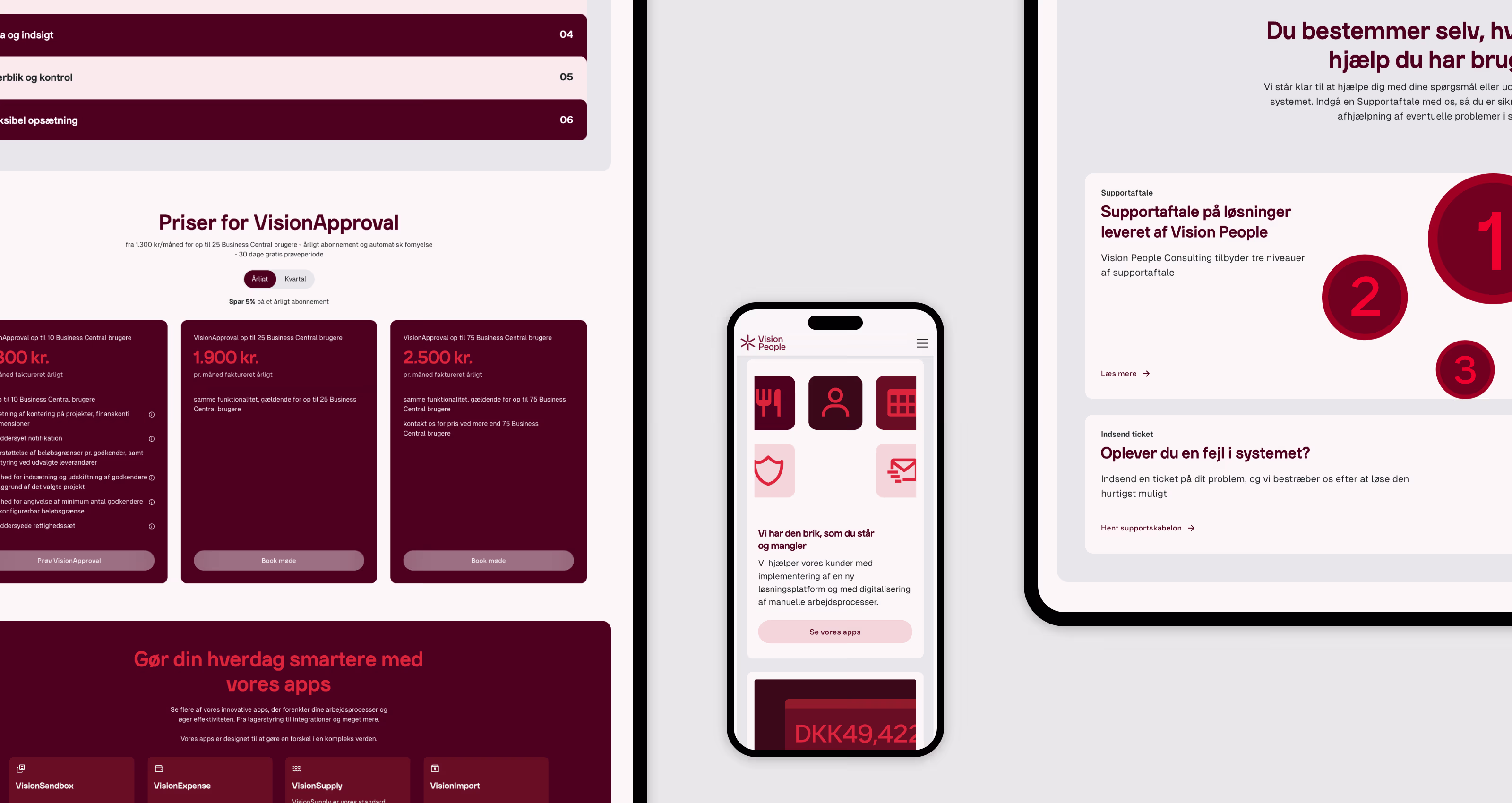
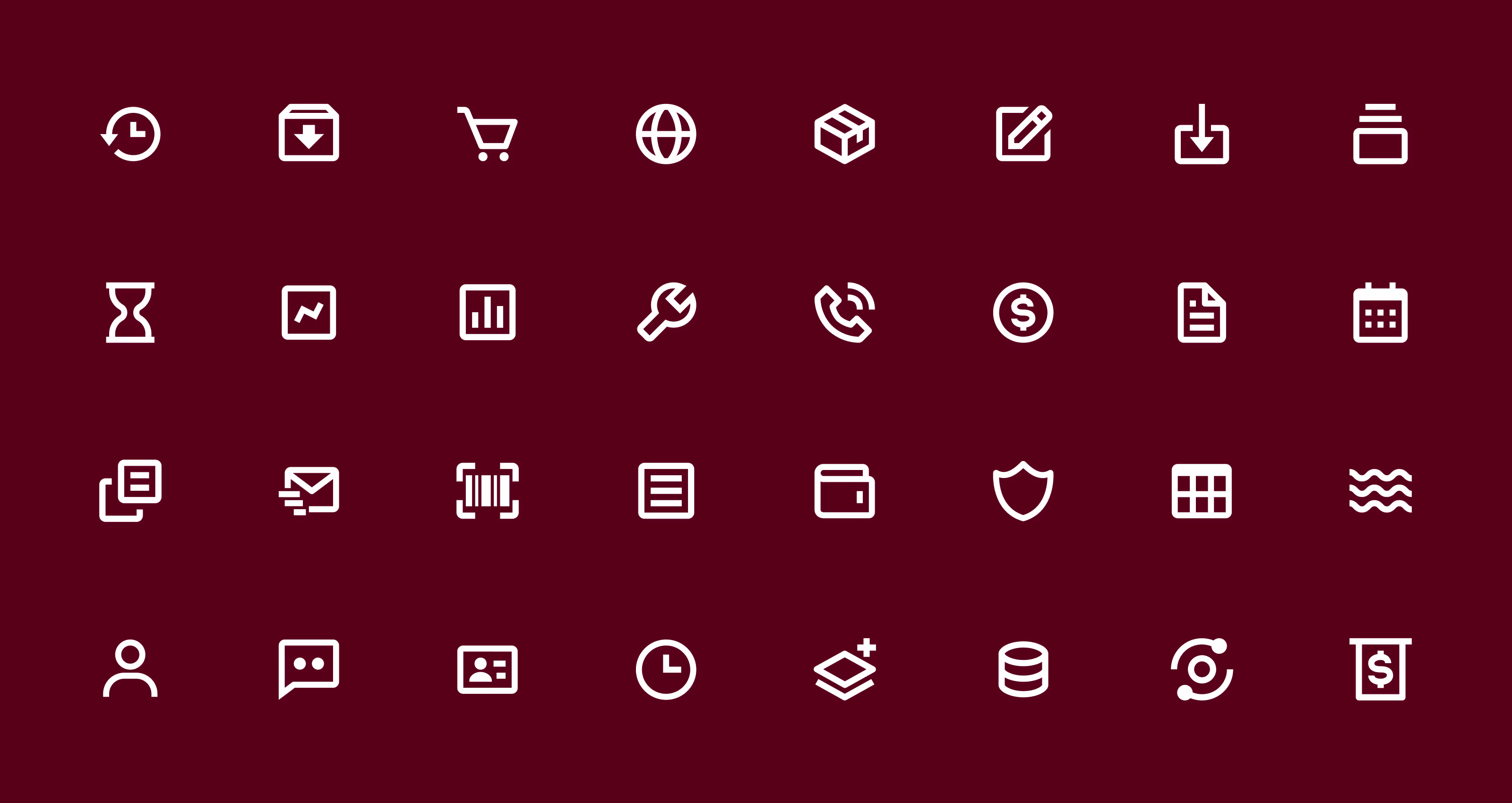
Based on the brand platform, we developed a flexible design system including color palette, iconography, graphic principles and imagery — a visual universe that scales seamlessly across digital and print applications. - Custom typography — Vision Sans
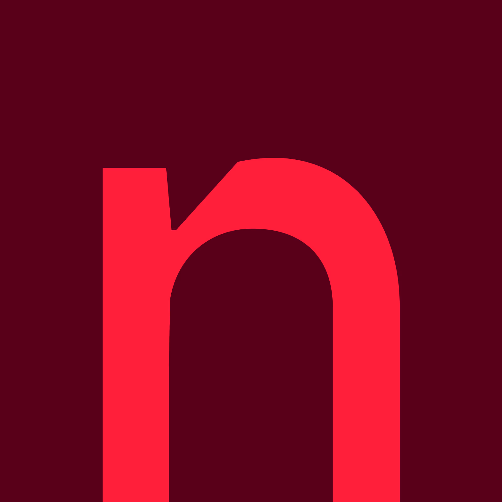
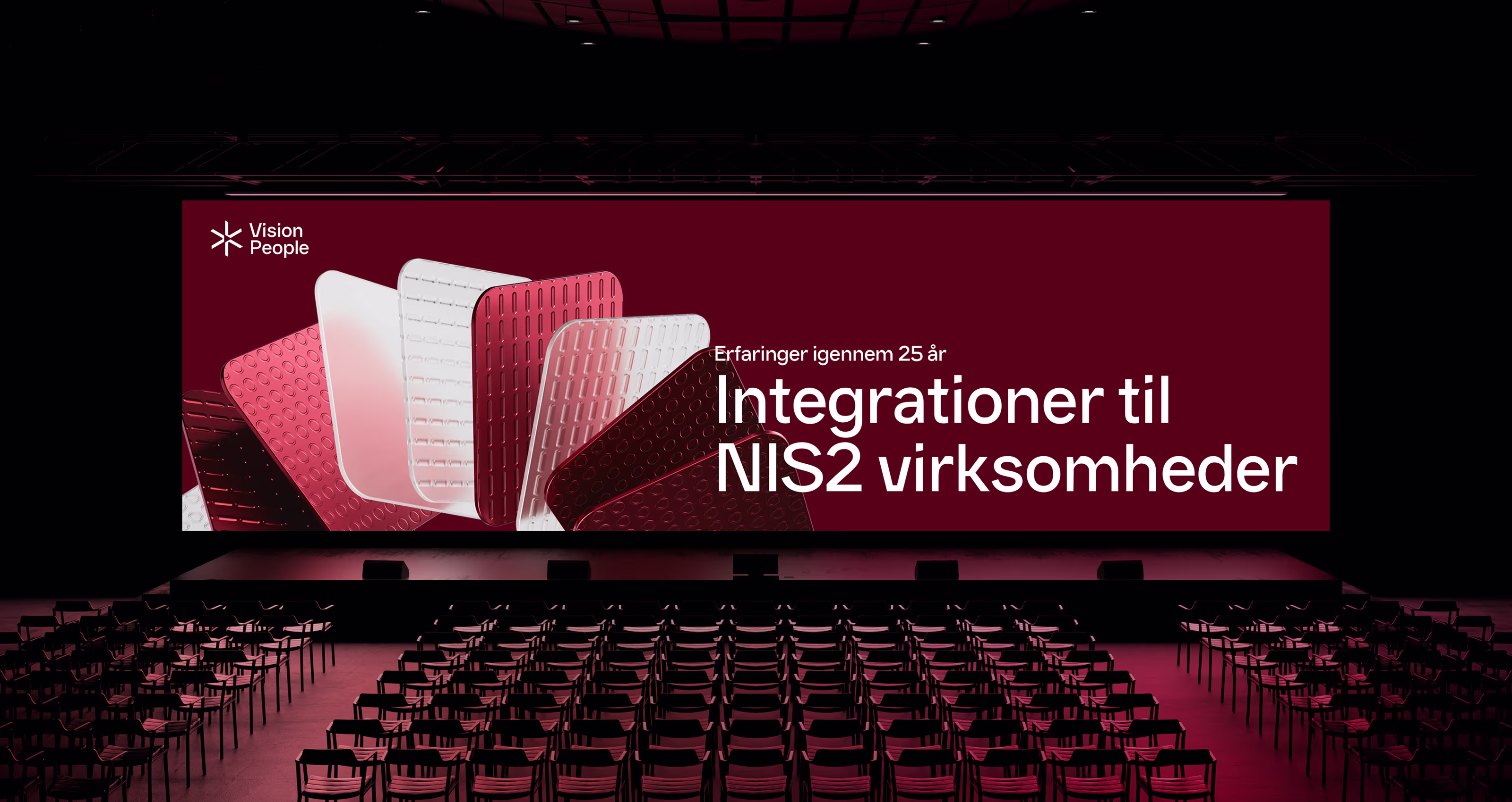
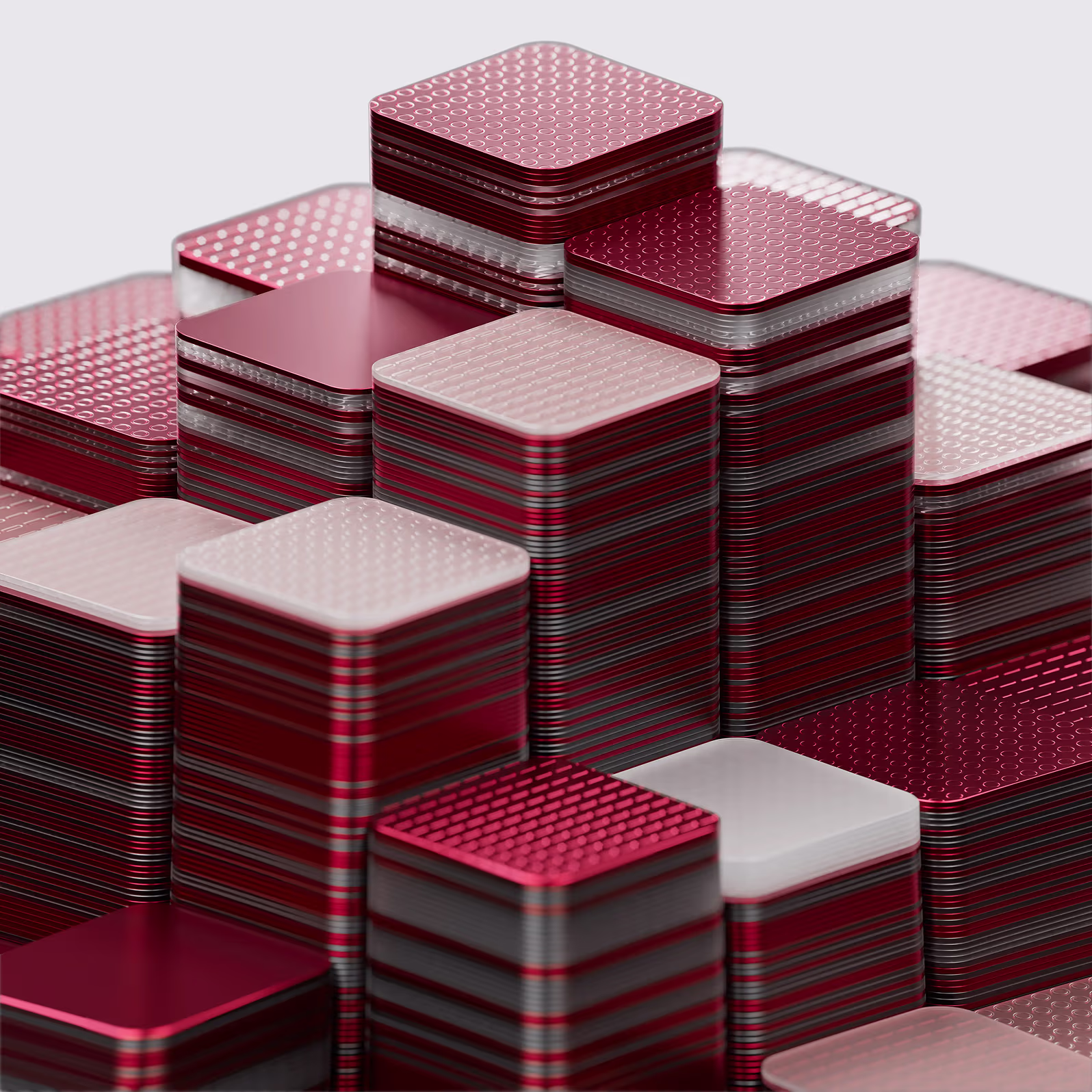
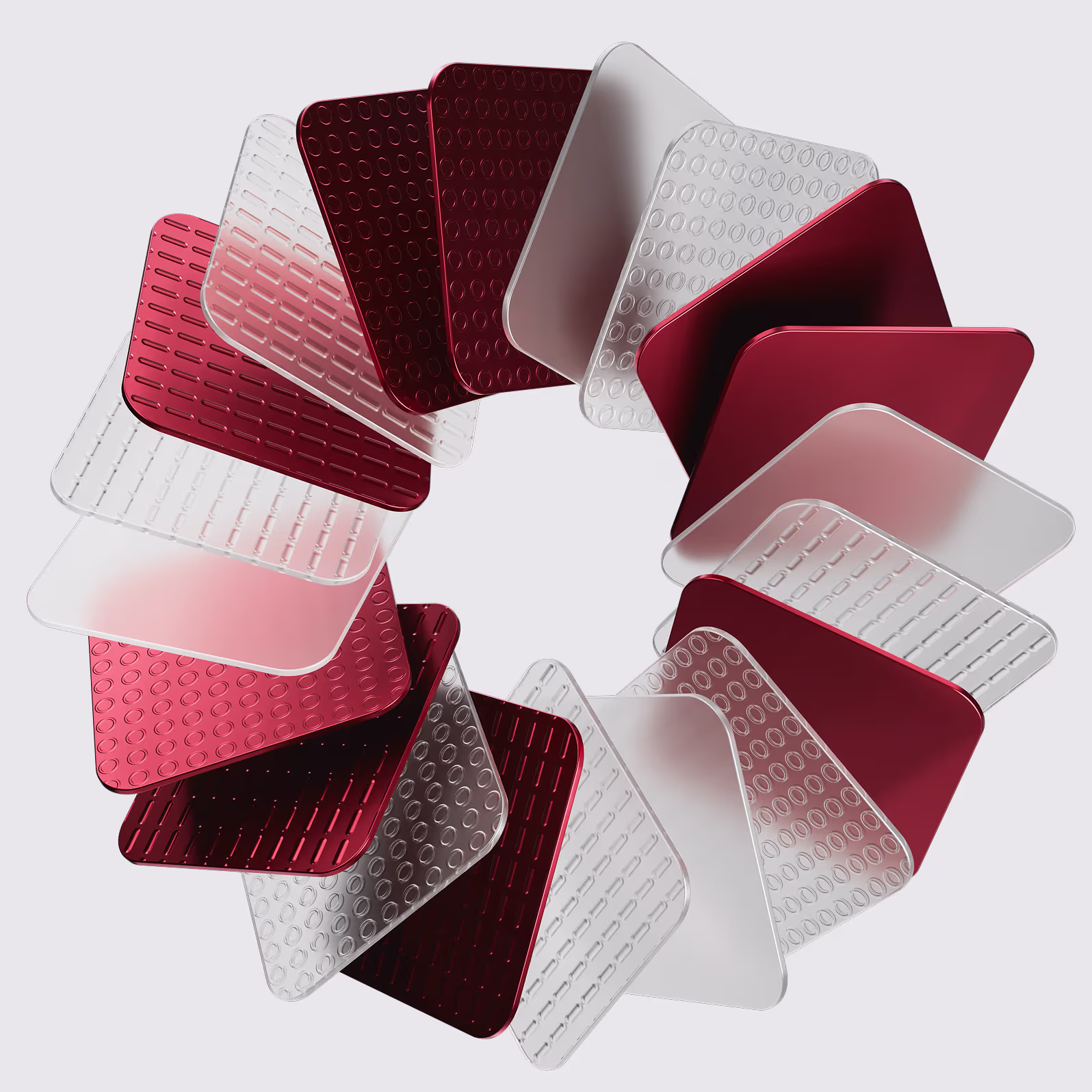
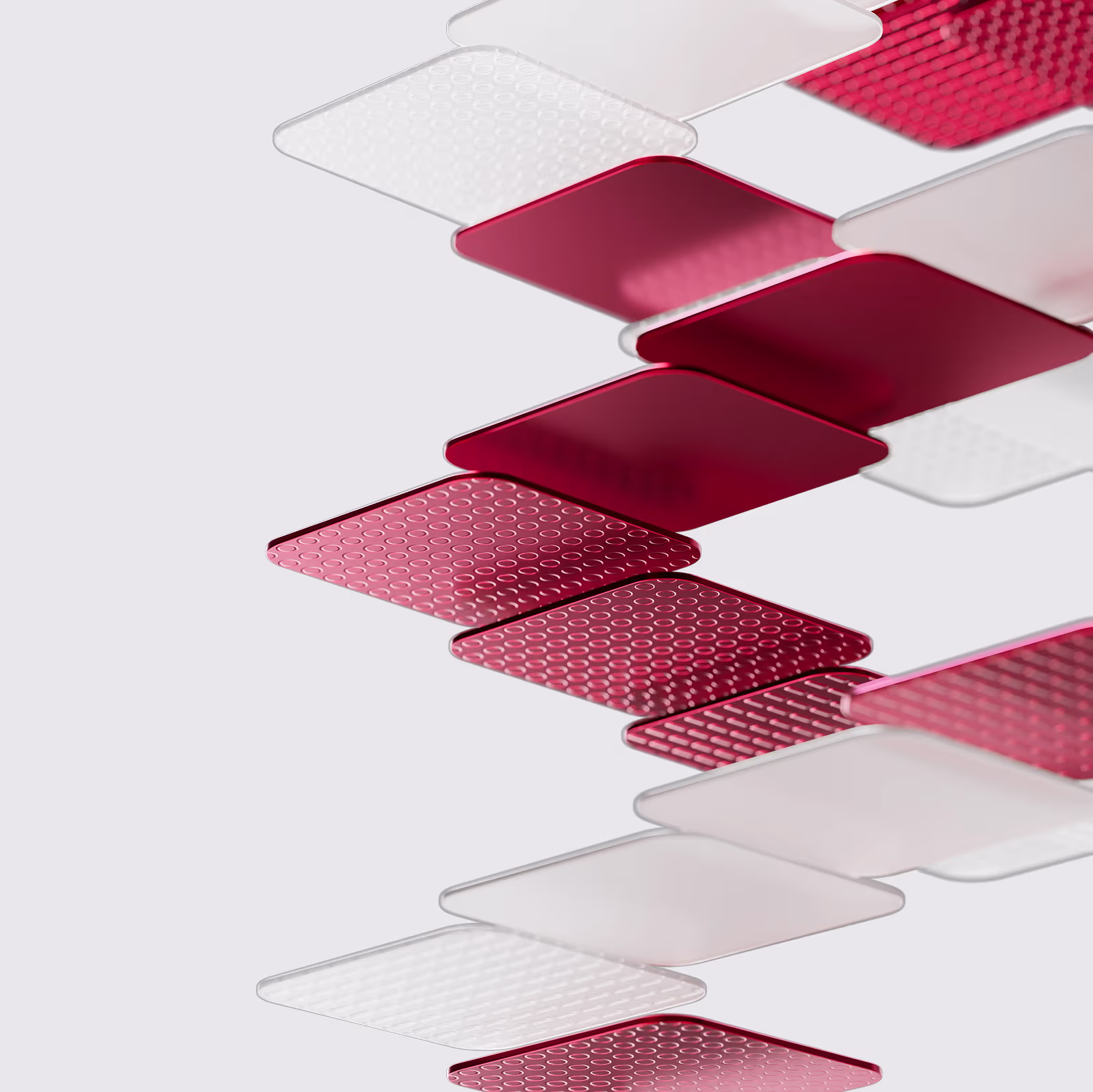
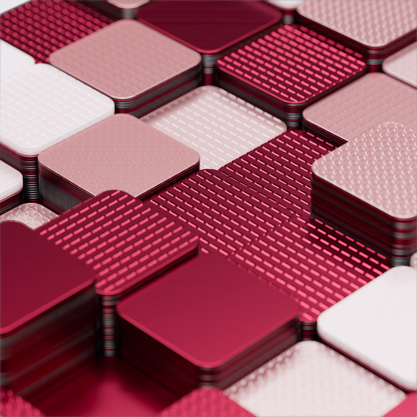
We designed a bespoke typeface, Vision Sans, exclusively for Vision People. The font brings character, consistency and recognition — functioning elegantly across headlines, body copy and digital interfaces. - 3D design language and motion
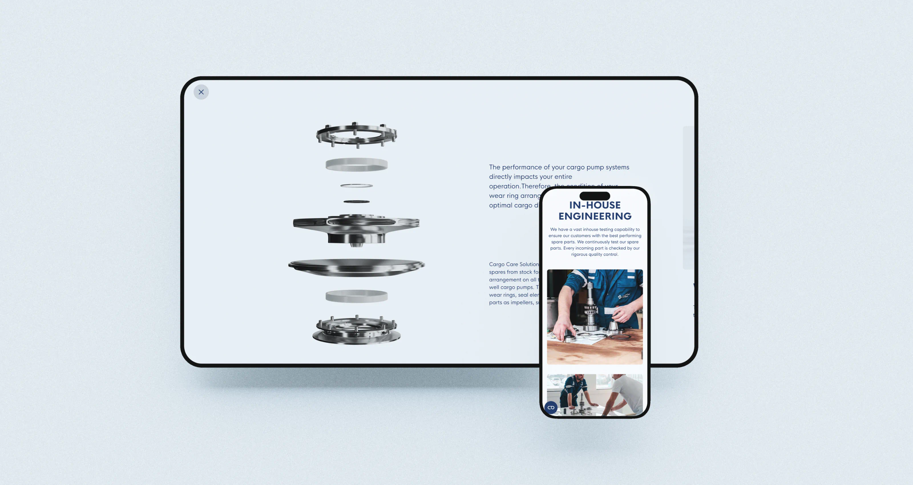
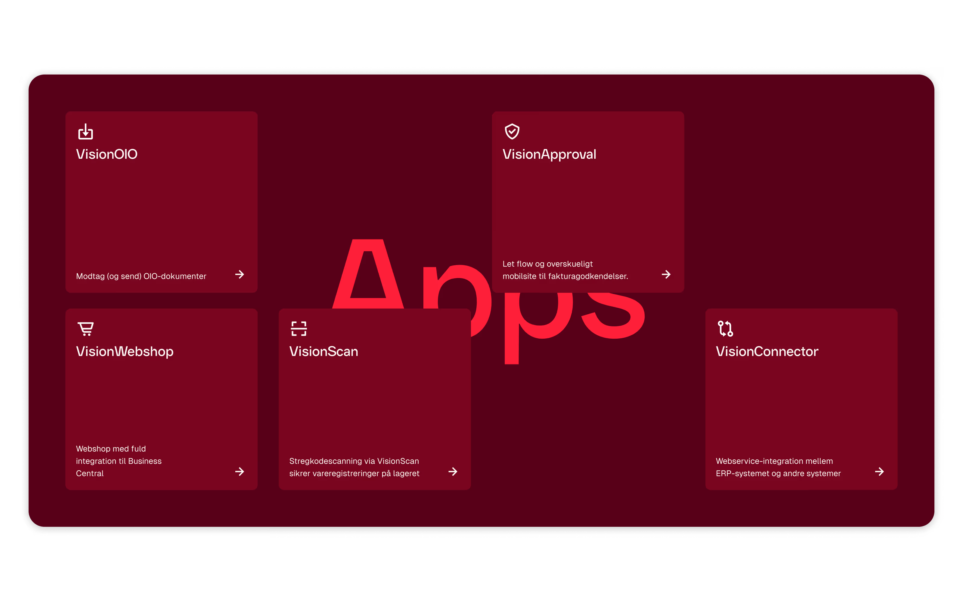
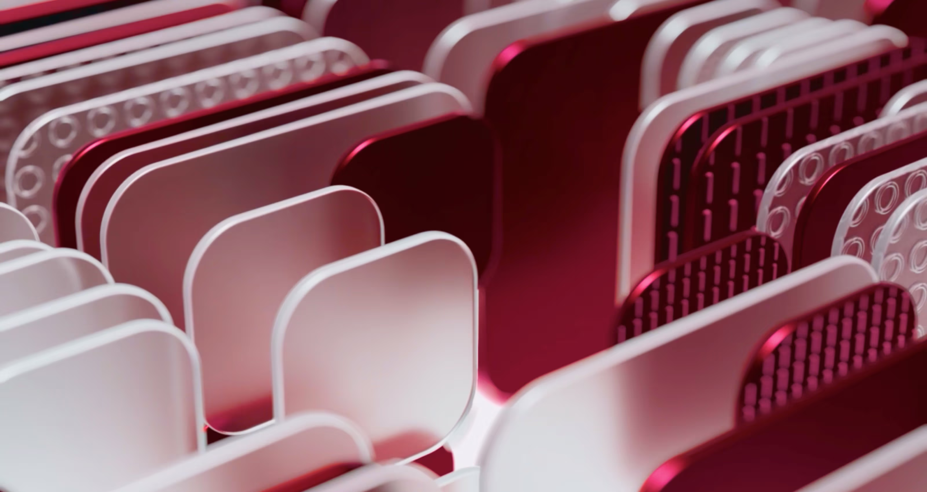
To add depth and modernity, we created a set of 3D elements that bridge brand and UI. These sculptural shapes introduce visual movement and unity across presentations, website visuals and digital products. - Digital implementation in Webflow
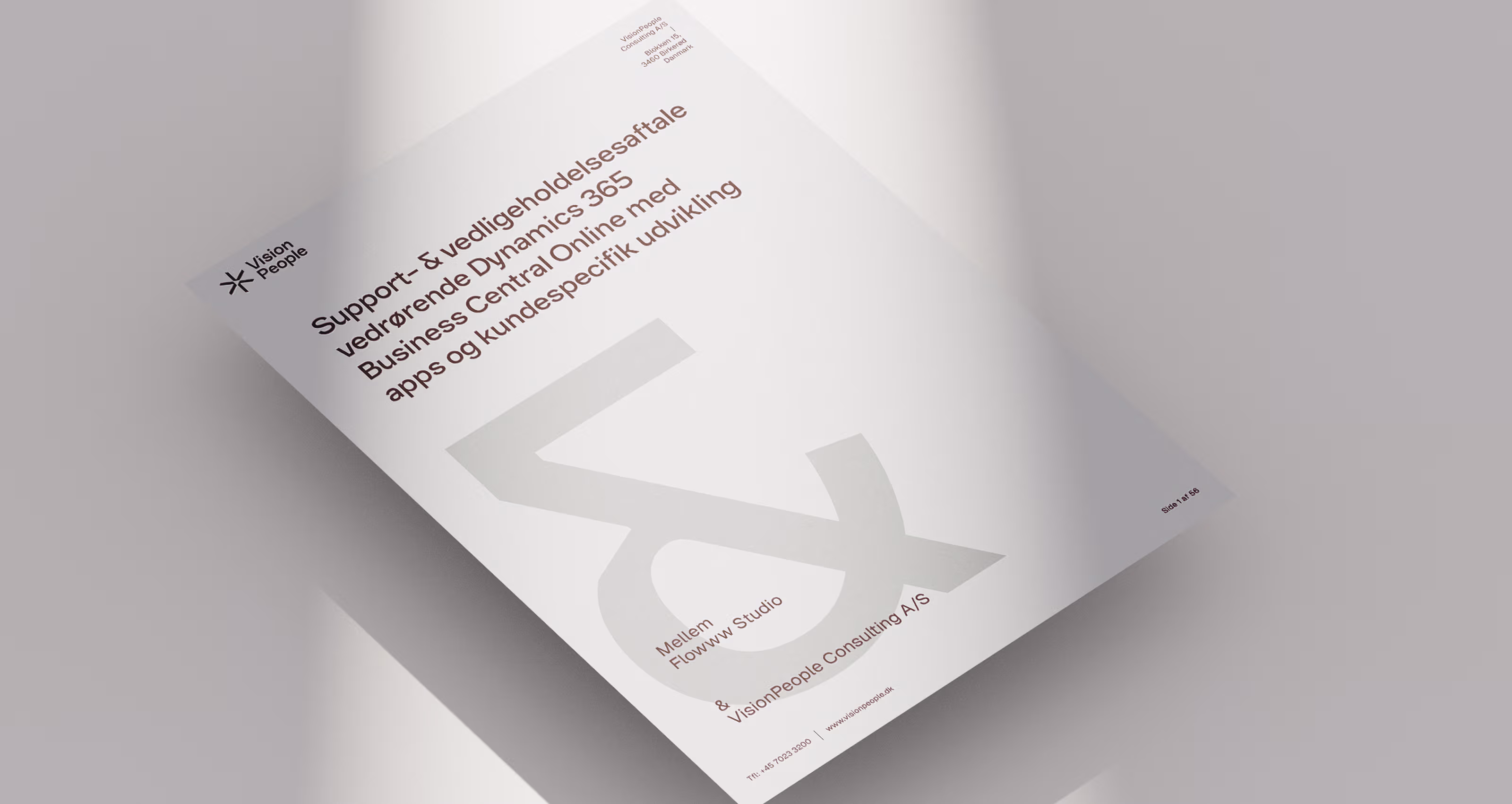
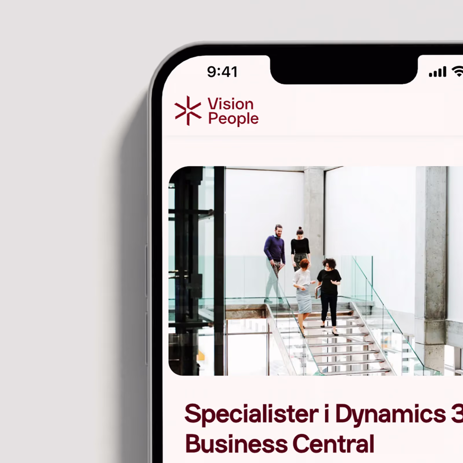
The new identity comes to life through a custom-built Webflow website — where typography, 3D assets and design language merge into a seamless digital experience. Webflow enables flexibility, performance and easy scalability for future growth.
What we did:
- We clarified Vision People’s core story, values, and communication style — balancing technical precision with a warm, human voice. Their new tone expresses clarity, confidence, and trust across every channel.
- we developed a scalable design system — a complete visual universe with refined color palette, iconography, and image direction that brings coherence to both print and digital touchpoints.
- We crafted Vision Sans, a bespoke typeface created exclusively for Vision People. It provides instant recognition and visual harmony across applications — designed to feel modern, intelligent, and enduring.
- we designed a 3D language that bridges brand and UI. These sculptural elements add a dynamic layer, connecting digital storytelling with product design.
- Finally, we brought the identity to life in a custom-built Webflow website — where typography, motion, and design seamlessly unite into a responsive, intuitive experience that reflects Vision People’s forward-thinking nature.


The collaboration with Flowww Studio was both inspiring and structured. They quickly understood who we are and translated that into a visual identity that truly reflects Vision People’s DNA. The new brand feels both modern and authentic — it’s exactly the balance we were looking for.

Per Ibsen, CEO
VisionPeople Consulting A/S